Hi,
I try to use the new UI from time to time, and there are some bugs/inconvenient things that prevent me to switch to the new UI. I sent additional details in email -I attached a screencast to show some of them.
Bugs:
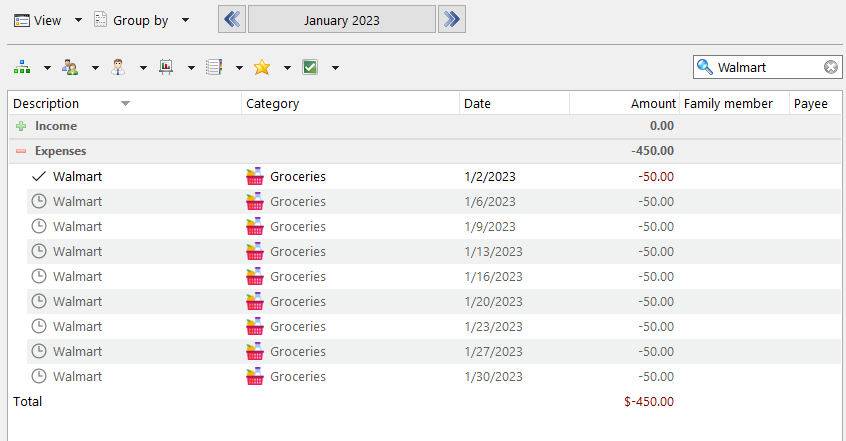
When I use the search, the application doesn't count the total amount of the found transactions but the whole split transactions too which contain the found transactions. I'm not able to see how much I spent on a specific item in total.
And when I select multiple items with the mouse, I'm able to include the "Income and expenses" total count row too in the selection.
Video


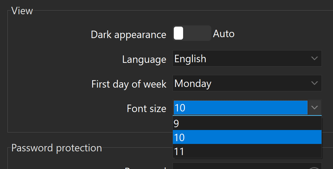
In the settings there is only three option when I want to change font size, all of them extremely small (much smaller than the default)

Resolution bug on Windows 11
When the application got out of focus, the resolution seems messed up. (I have two monitors with different resolutions)
From this bug, the application starting become unusable. Every time I navigate back to the application, I have to readjust all the columns.
Video
When I click on a group and select multiple accounts, the currency of the split transactions changes to USD. The currency is wrong in other places too.
Video
The previous UI filled the corresponding amount too when auto-complete happened. When I create a split transaction it doesn't work now. See in the video in point 6.
When I add a split transaction, the input field is not saved when I click out of it and got out of focus.
Video
There is no easy way to add a transaction to a split transaction. The only way if I create a new transaction and set the date and time again, then I drag-and-drop into the split transaction. It is very slow. I should be able to reopen the split transaction edit windows after the creation. But after I create the split transaction I am not able to open again that edit window.
Because of the previous one - I'm not able to open the split transaction edit window - when I search for a transaction with search, I can't see the other transactions in the containing split transaction except for the single one transaction I searched for. In order to see all the transactions in the split transaction I have to navigate there with the date pick.
Video
Other
The order of the categories is now in alphabet order and there is no way to rearrange them. It was way faster when I arrange the most used categories on the top of the list.
If I want to see all of my accounts at once, I have to select them manually one by one with Ctrl + Right click. In the previous UI, there was an "All" button for this.
The currency (in my case HUF) is very distracting before every amount. Would be awesome if I could turn it off in the settings.
Add tags to transactions became cumbersome because I can't add the Tags column in the split transaction edit window. Assuming that I want to set different tags after I create the split transaction I have to open every transaction inside it one-by-one in order to set their tags.
I'm not able to turn off the dark theme. There is only an Auto and an Enabled mode. If I'm using windows with dark theme, I can't use the software in light mode. I think this is an unnecessary limitation.
+(this is just a subjective opinion)
(I really hope that these initial issues in the new UI will be solved because it was a near-perfect software that was a pleasure to use. I used the new UI quite a lot and somehow the old UI is more transparent, easier to see what's going on despite it wasn't so modern-looking. I'm still thinking about why is this, I will share my thoughts later on.
But three things I can think of
-The alternate row colors in the lists help
-The new style of the expand/collapse icon and the checkbox in front of the transactions seem a little distracting
-The currency symbol/name in front of each amount
If any of these are unclear, I gladly describe them in more detail or provide additional info.
Please consider addressing these problems, because they significantly slowed down the work with the software.